How to Communicate With Your Customers During Times of Crisis
Emotions are important in design because they are a powerful motivator and can influence perception, cognition, attention, decision-making, learning, memory and behavior. If we can learn how to evoke, predict or assess a specific emotion in design, we can better present information in a way that aids in understanding and retaining information and communicate more effectively.
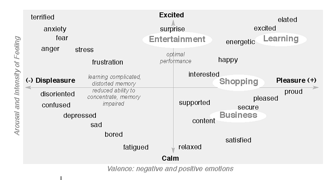
Extreme states of emotions such as anxiety, fear and anger can complicate learning because they interfere with sensory perception. Sensory systems allow us to make sense of ourselves and our surroundings and if distorted can cause the emotional organization of our experience to be compromised. As a result, learning can be detrimentally affected. Under stress users can develop tunnel vision and auditory exclusion. For example, they wouldn’t hear an alarm going on while trying to complete a task.
When a person is highly aroused, as in a very shocking or surprising situation, they are more likely to form a memory of the event and possibly a distorted memory. Arousal (excited/calm) has been found to be a better predictor of memory retention than valence (pleasure/displeasure). However, strongly negative things tend to automatically be highly arousing, leading many to think that better memory is correlated with negativity. If we are depressed, anxious or tired, we are more likely to have difficulty remembering. When we are upset or distracted, we cannot concentrate as well which impairs our memory. Too much stress results in poor performance.
To help communicate with your customers during periods of stress, fear, or anxiety several design principles are critical.
Use bite-size chunks of information
Users can only consciously process small amounts of information at a time. Grouping and chunking information aids in memory retention.
Consistency and standards
Users should not have to wonder whether different words, situations, or actions mean the same thing. Be consistent.
Error prevention
Even better than good error messages is a careful design which prevents a problem from occurring in the first place.
Recognition rather than recall
Make objects, actions, and options visible. The user should not have to remember information from one part of the dialogue to another. Instructions for use of the system should be visible or easily retrievable whenever appropriate.
Aesthetic and Minimalist Design
Dialogues should not contain information which is irrelevant or rarely needed. Every extra unit of information in a dialogue competes with the relevant units of information and diminishes their relative visibility.
Anticipation
Anticipate the user’s wants and needs. Bring to the user all the information and tools needed for each step of the process.
Inconsistency
It is just important to be visually inconsistent when things must act differently as it when things act the same.
Good design is design thinking made invisible. Now more than ever, it’s important to understand and empathize with your customers, make doing business with you easy and intuitive, and provide clear communication.
